Product Design
THE CONTEXT
A campus experience spread across too many places
PeerHub was being built as a digital campus ecosystem for college students bringing communities, clubs, events, content and opportunities into one place.
When I joined, there wasn't an existing design system or established product experience to build on. I had to help turn the idea into something tangible across multiple surfaces: a student-facing mobile app, a web platform and an admin panel.
The challenge wasn't simply designing screens. It was figuring out how all these experiences should connect, how different users should move through them, and how the product could feel natural to a Gen-Z audience without becoming visually chaotic.
I worked as one of the core Product Designers and was involved across the product from flows and information architecture to UI, responsive design and developer handoff.

THE PROBLEM
Students had communities. They just weren't connected.
Before PeerHub, a lot of campus activity lived across different tools and channels.
Updates could happen through WhatsApp groups.
Events could be promoted through Instagram.
Club registrations could happen through Google Forms.
Information could be buried in PDFs or scattered across different conversations.
For students, this meant constantly switching between places.
For the people managing the ecosystem, it created a different problem: there wasn't one structured system to manage content, clubs, events, users and moderation.
So the product needed to solve two sides of the same problem:
For students
Make campus life easier to discover, join and participate in.
For admins
Make the growing ecosystem easier to manage and moderate.
The design challenge was to bring both sides together without making the product feel like another formal college portal.

THE DESIGN CHALLENGE
How might we make a complex campus ecosystem feel simple?
The product had multiple audiences, multiple types of content and multiple actions happening at the same time.
The challenge was to create enough structure to make the product scalable, while keeping the experience lightweight and social.
I focused on three questions:
01
What does a student need to see first?
02
How should different features connect without competing for attention?
03
How can the same design language scale across student and admin experiences?
This became the foundation for the design direction.

UNDERSTANDING THE USERS
I started with people, not screens.
Before jumping into UI, I spent time understanding the people PeerHub was being built for.
The product had very different user needs students discovering communities and events, student leaders managing activities, and internal teams responsible for content and moderation.
I used conversations, empathy mapping, personas and journey mapping to understand what users were trying to accomplish, where they were getting stuck, and what they expected from the product.
The research helped move the conversation from:
"What features should we add?"
to:
"What should the user be able to accomplish easily?"

KEY INSIGHTS
The product had to feel like college not corporate software.
A few principles became clear during the design process.
01 - Discovery needed to feel natural
Students shouldn't have to search through multiple sections to find something interesting.
Opportunity: Create a content-led experience where clubs, events and community activity could naturally surface.
02 - Different users needed different levels of control
Students needed simplicity.
Admins needed structure.
Trying to give everyone the same interface would create unnecessary complexity.
Opportunity: Design role-specific experiences instead of forcing every user through the same product structure.
03 - Social behaviour had to influence the UX
The product was about participation, not just information.
Following, saving, posting, joining and interacting needed to feel lightweight.
Opportunity: Use familiar interaction patterns rather than making students learn a new system.
04 - The system had to scale beyond individual screens
Because the product was being built from scratch, every component decision would eventually affect dozens of screens.
Opportunity: Establish a reusable design system early instead of designing every screen independently.

INFORMATION ARCHITECTURE
I structured the product around what students actually come to do.
Rather than organizing the product around internal business categories, I focused the structure around student behaviour.
Core experience
Home
↓
Discover content, communities and activities
Communities
↓
Find people, clubs and conversations
Events
↓
Discover and participate
Content
↓
Explore relevant posts and information
Profile
↓
Manage identity, activity and interactions
For the admin experience, the structure shifted toward:
Users · Content · Clubs · Events · Moderation · Management
This separation helped keep the student experience lightweight while giving admins the control they needed.

USER FLOWS
I designed flows around actions, not screens.
Once the structure was clear, I mapped the key journeys.
For students, some of the important flows included:
Discover → Join Club → Participate
Discover Event → View Details → RSVP
Home → Content → Follow / Save
Sign Up → Explore → Build Profile
For admins:
Review → Approve → Publish
Manage → Moderate → Resolve
The goal was to make the important actions feel predictable and reduce unnecessary navigation.
I kept asking one simple question:
Can the user understand what to do next without thinking too much about the interface?
The resulting flows were designed to reduce confusion and keep primary actions close to the point of decision.

DESIGNING THE SYSTEM
Designing 200+ screens meant I couldn't design every screen from scratch.
One of my biggest priorities was creating a system that could scale.
I established reusable patterns for:
Navigation
Cards
Buttons
Forms
Content modules
Club components
Event components
States
Modals
Tables
Admin controls
Responsive behaviour
The goal wasn't just visual consistency.
It was to make future design and development faster.
I also had to think about how the system would behave across different screen
sizes and how components would translate into development.
I delivered 200+ responsive screens in under two weeks, so having a structured component approach was essential.

EXPLORATION
The first version wasn't the final version.
Because PeerHub was a new product, there were many decisions that needed to be explored before the visual direction settled.
I explored different approaches to:
Content hierarchy
Navigation
Card structures
Community discovery
Event presentation
Information density
Admin dashboards
Responsive layouts
The goal was not to make the interface visually interesting for its own sake.
Every iteration was about answering a product question:
What deserves attention?
What can be secondary?
What should happen next?
What can we remove?

THE FINAL EXPERIENCE
A campus experience designed to feel familiar.
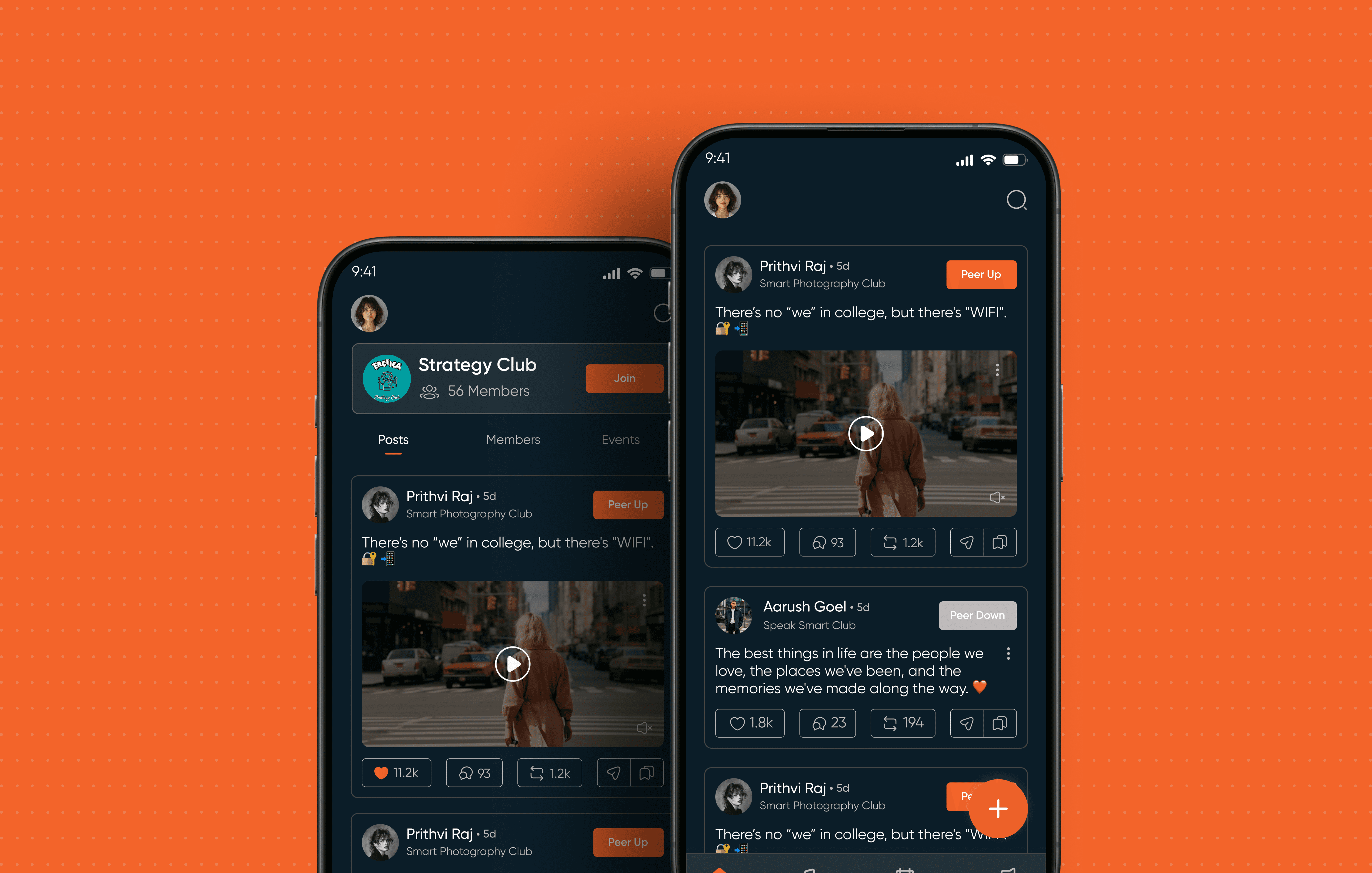
The final experience brought communities, clubs, events and content into a single ecosystem.
Instead of feeling like a traditional college management platform, the interface was designed to feel more visual, social and familiar to the students it served.
The product was built across three connected surfaces:
Mobile App
For students to discover, participate and interact.
Web App
For broader exploration and access to the PeerHub ecosystem.
Admin Panel
For managing users, content, clubs, events and moderation.

A CLOSER LOOK: DISCOVERY
Making the home experience easier to scan.
The home experience had to balance multiple types of content without making everything feel equally important.
I focused on:
Clear content hierarchy
Familiar card patterns
Strong visual entry points
Scannable sections
Clear interaction states
Relevant calls to action
The result was a feed that could support different types of campus activity while still feeling cohesive.

A CLOSER LOOK: CLUBS & EVENTS
Turning passive discovery into participation.
Clubs and events were central to the PeerHub experience.
Instead of treating them as static listings, I designed them as entry points into the community.
The experience allowed users to:
Discover → Understand → Join / RSVP → Participate
The design focused on making the information needed for a decision easy to find while keeping the interaction lightweight.

A CLOSER LOOK: ADMIN
The student experience was only one side of the product.
Behind the community was an admin system responsible for keeping the ecosystem organized.
Admins needed to manage:
Users
Content
Clubs
Events
Approvals
Moderation
I designed the admin experience around visibility and action.
Instead of overwhelming users with data, the interface prioritized:
What needs attention?
What action can I take?
What has already been handled?

DESIGNING ACROSS SURFACES
PeerHub was designed across multiple product surfaces, with each experience adapting to its context.
I worked across mobile, web and admin experiences while keeping the underlying product structure consistent.
The goal was to make each surface feel purposeful rather than simply replicating the same interface everywhere.
WORKING WITH DEVELOPERS
Designing with developers, not just handing designs over.
Because PeerHub was an early-stage product, speed mattered.
I worked closely around:
Component consistency
Responsive behaviour
States
Edge cases
Design specifications
Developer handoff
The design system helped create a shared language between design and
development.
This was especially important when working across 200+ responsive screens in a short delivery window.

THE OUTCOME
From an empty canvas to a live multi-campus product.
PeerHub went from having no established product design system to a connected experience across mobile, web and admin.
The platform reached 70+ college campuses during beta, giving the team real feedback to continue shaping the product.
The existing project tracking also records several observed outcomes:
2×
Higher daily retention observed during the first three weeks of app usage.
40%+
Increase in content engagement through Peer Up and Save interactions.
70+
College campuses onboarded organically during beta testing.
35%
Reduction in home-feed bounce rate after improving content structure.
FROM 0 → 1
PeerHub started without an established product structure or design system.
I shaped the experience around the way students discover, participate and connect while giving admins the structure they needed to manage the ecosystem.
FROM
No established product structure
Multiple student needs across different journeys
Separate mobile, web and admin requirements
No reusable design system
TO
One connected campus ecosystem
Clear discovery and participation flows
Role-specific student and admin experiences
Reusable system across 200+ responsive screens
And the image underneath = your strongest final ecosystem visual.
WHAT I LEARNT
Designing from zero taught me to think beyond individual screens.
PeerHub was one of my first experiences of working on a product where there wasn't an existing design system to follow.
I learned that 0→1 product design is not about having every answer at the beginning.
It's about creating enough structure to move forward, testing what works, learning quickly and being willing to change direction.
I learned three things in particular:
01 - Systems matter early.
When you're designing hundreds of screens, consistency can't be an afterthought.
02 - Complexity should stay behind the scenes.
Users shouldn't have to understand the complexity of the product to use it.
03 - Real feedback beats assumptions.
The product changed as we learned from students, admins and actual usage.
The biggest takeaway for me was simple:
Good product design makes a complex system feel obvious.

FINAL REFLECTION
What started as an empty Figma file became a complete product ecosystem.
PeerHub pushed me to think across UX, UI, systems, responsive design and product structure at the same time.
I wasn't designing one feature in isolation.
I was thinking about how students discover something, how they interact with it, how admins manage it, how the system scales, and how all of those pieces stay connected.
That experience changed how I approach product design.
I stopped thinking of screens as the product.
I started thinking about the system behind them.