Product Design
THE CONTEXT
Hotel check-in isn't always predictable.
Travel plans don't always follow standard hotel check-in and check-out times.
A traveller might arrive earlier than expected, have a late flight, or simply need more flexibility around their schedule.
The existing experience didn't give users a structured way to communicate an early or late check-in requirement.
This created uncertainty:
Can I check in early?
Will my room be available?
What happens if I arrive late?
I worked on Flexi Check-In, a feature designed to bring this flexibility into the booking experience instead of leaving users to figure it out separately.

THE PROBLEM
Travellers needed flexibility, but the experience didn't make it clear.
The core problem wasn't simply the lack of an early or late check-in option.
It was the uncertainty around availability and what the traveller could actually request.
Users needed a simple way to:
Indicate when they expected to arrive
Understand available check-in options
Know what they were requesting
Make a decision without unnecessary back-and-forth
The experience therefore needed to communicate flexibility without adding complexity to the booking journey.

THE DESIGN CHALLENGE
How might we give travellers more control without complicating booking?
I focused on three questions:
01
How can we make the option discoverable without interrupting the main booking flow?
02
How can users understand available time slots quickly?
03
How can we communicate availability clearly enough for users to make a confident decision?
The goal was to make Flexi Check-In feel like a natural extension of the existing booking experience rather than a separate process.

UNDERSTANDING THE EXPERIENCE
I first looked at the existing booking/check-in journey and identified where flexibility could naturally fit.
The important consideration was timing.
Users shouldn't have to complete their booking and then go searching for a separate check-in request.
Instead, the flexibility option needed to appear at a point where the user's arrival information was already relevant.
This helped define the feature as an optional part of the journey, rather than a mandatory additional step.

THE CORE IDEA
Make flexibility visible, optional and easy to understand.
The solution was to introduce Flexi Check-In as an optional feature within the booking experience.
Instead of asking users to understand a complicated policy, the interface focused on the decision they actually needed to make:
When do you need to check in?
Users could explore available time slots and understand the availability before making their selection.
This reduced the cognitive load of interpreting hotel policies and turned it into a simple interaction.

INFORMATION & CONTENT HIERARCHY
The user shouldn't have to read a policy to make a decision.
One of the important design considerations was content hierarchy.
The interface needed to communicate:
What is Flexi Check-In?
↓
What time can I select?
↓
Is it available?
↓
What happens after I select it?
I kept the primary decision prominent and moved supporting information into secondary levels.
This allowed users who already understood the feature to move quickly while still giving additional context to users who needed it.

THE USER FLOW
From uncertainty to a clear choice.
The core flow was designed around a simple sequence:
Discover Flexi Check-In
↓
Understand the option
↓
Select preferred check-in timing
↓
View availability
↓
Confirm selection
The interaction needed to feel lightweight because users were already in the middle of a larger booking journey.

EXPLORING THE INTERACTION
The interaction had to make time selection effortless.
I explored different ways of presenting check-in timing and availability.
The main consideration was how quickly users could scan the available options and make a choice.
The final interaction used a visual slot-selection approach so that users could understand their options without reading through long descriptions.
THE FINAL EXPERIENCE
A simple way to request more flexibility.
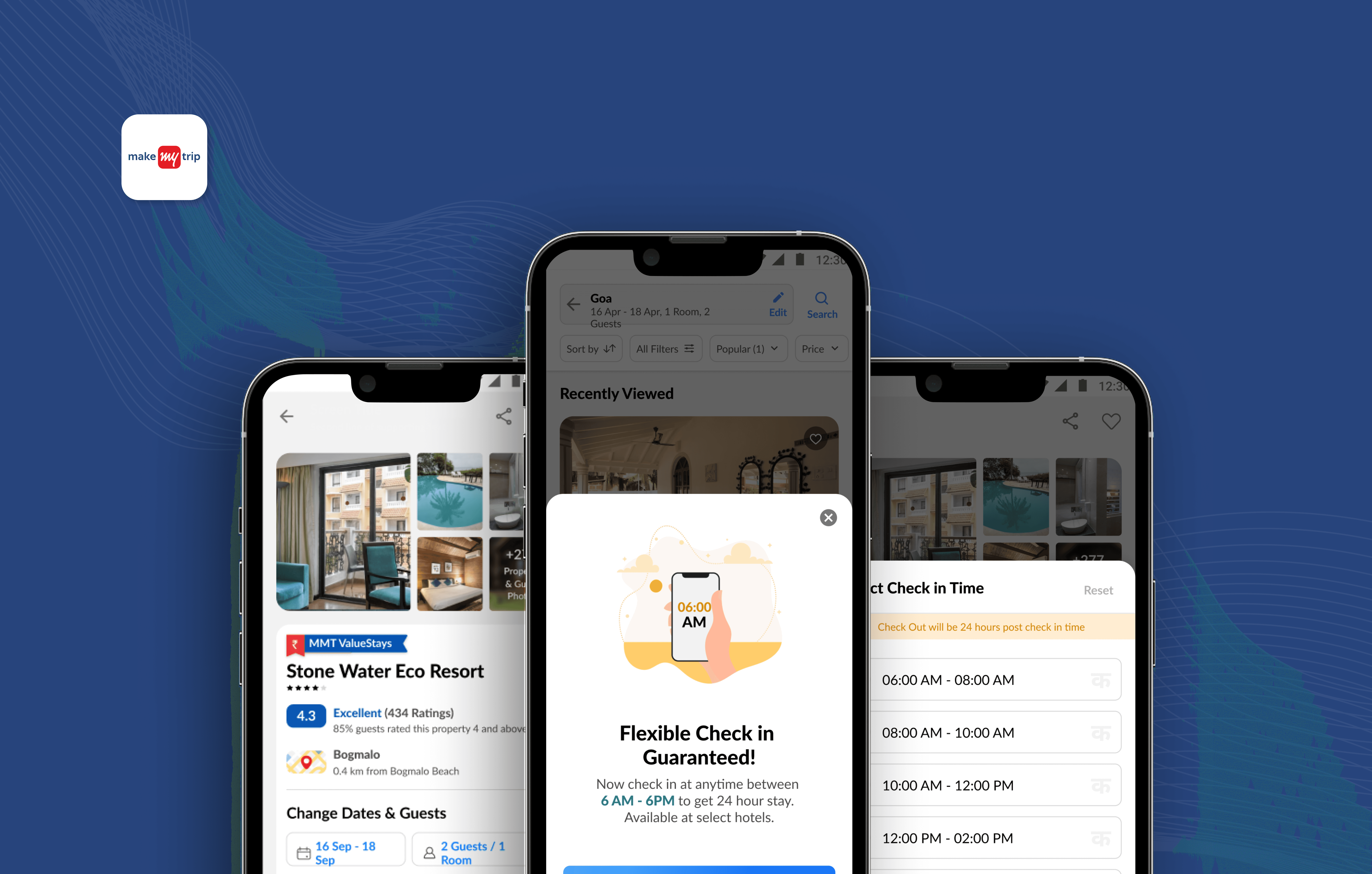
The final Flexi Check-In experience integrated the feature into the existing booking journey.
Users could see the option, explore available timings and select the one that suited their travel plans.
The design focused on:
Clear availability
Visual time selection
Simple hierarchy
Minimal additional steps
A clear confirmation state
The result was an experience that gave users more flexibility without making the overall booking flow feel heavier.

DESIGNING ACROSS PLATFORMS
One experience, adapted to different contexts.
The feature was designed across:
Android
iOS
PWA
The goal wasn't to simply replicate the same screen across platforms.
I considered how the interaction, hierarchy and components would translate across different screen sizes and platform behaviours while maintaining a consistent experience.

THE DECISION MOMENT
The important interaction was the selection itself.
The user doesn't need to understand the complexity behind hotel availability.
They need to answer one question:
Which option works for me?
The interface therefore prioritized:
Time → Availability → Selection → Confirmation
This kept the experience focused on the traveller's decision rather than exposing unnecessary operational complexity.
OUTCOME
The feature made the decision faster and easier.
The redesigned experience showed measurable improvement during usability evaluation.
20%
Flexi Check-In opt-in rate
94%
Usability task completion
14s → 7s
Decision time reduced by 50%
These metrics demonstrate that users were not only able to complete the flow, but could make the check-in decision considerably faster.
WHAT I LEARNED
Flexibility doesn't have to mean complexity.
This project taught me that when a product introduces an additional choice, the design challenge isn't necessarily about removing the choice.
It's about making that choice easy to understand.
For Flexi Check-In, the product needed to offer more flexibility while keeping the booking experience simple.
The biggest lesson for me was:
Give users more control, but don't make them work harder to use it.

MY ROLE
As a UX Designer on the project, I worked across the end-to-end experience, including:
UX strategy
User flow
Interaction patterns
Content hierarchy
Interface design
Cross-platform experience
Prototyping and refinement
The project gave me experience designing within a mature consumer travel product while thinking carefully about user expectations, business constraints and interaction simplicity.

FINAL REFLECTION
Flexi Check-In was a relatively focused feature, but it taught me an important product-design lesson.
A feature doesn't need to add more screens or functionality to create value.
Sometimes the value comes from taking an existing moment of uncertainty and making it clear, predictable and actionable.
For me, that was the core of Flexi Check-In:
More flexibility for the traveller.
Less uncertainty in the journey.

WHAT MADE THIS PROJECT CHALLENGING
Designing within an existing product
One of the biggest challenges was not designing a completely new product from scratch.
The feature had to work within an existing travel-booking experience, which meant every new interaction had to feel familiar to users.
I had to think about:
Where the feature should appear
How much information users actually needed
How to introduce a new option without distracting from booking
How the interaction would fit into the existing design system
How the experience could work consistently across platforms
The challenge was therefore to add flexibility without adding friction.
SMALL DETAILS THAT MATTERED
The experience was built around reducing uncertainty.
A traveller making a check-in decision is not just selecting a time.
They are trying to understand whether their plan will actually work.
So I paid attention to small details such as:
Availability
Making it clear which options could actually be selected.
Hierarchy
Making the most important information visible first.
Feedback
Making the selected state and next step obvious.
Clarity
Avoiding unnecessary information during the decision.
These details helped turn what could have been a complicated hotel policy into a much simpler interaction.
FROM IDEA TO FINAL DESIGN
The final screen was only one part of the work.
What you see in the final design came from multiple rounds of thinking, exploring and refining.
I started by understanding the existing journey, explored different ways of presenting the option, and then narrowed the experience down to the interaction that felt easiest to understand.
WHAT I WOULD IMPROVE
If I had more time, I would take the experience further.
Looking back at the project, I would explore how Flexi Check-In could work beyond the initial booking moment.
For example, I would explore how the experience could help travellers manage changes to their arrival time after booking, and how the product could communicate updates when availability changes.
I would also want to validate the experience with a broader range of travellers and test different ways of communicating availability and expectations.
This would help move the feature from simply offering flexibility to supporting travellers throughout the journey.
KEY TAKEAWAYS
Three things I took away from the project
01 - More options don't always mean a better experience.
When introducing flexibility, the interface needs to make the decision easier rather than simply giving users more choices.
02 - Context matters.
A feature is much more useful when it appears at the moment users actually need it.
03 - Clarity creates confidence.
Especially in travel, users need to know what they can do, what is available and what happens next.
FINAL THOUGHT
Designing for travel means designing for uncertainty.
Travel rarely goes exactly according to plan.
A flight can arrive early.
A plan can change.
A traveller can reach a hotel at a different time than expected.
Flexi Check-In was a small feature, but it showed me how thoughtful product design can make these moments easier.
Give travellers more flexibility.
Make the choice clear.
And remove uncertainty wherever possible.