Product Design
THE CONTEXT
Property platforms can become overwhelming very quickly.
Searching for a property is not simply about finding a listing.
Users need to compare properties, understand important details, evaluate whether something fits their requirements and eventually take action.
That means the interface needs to handle a lot of information without making the experience feel complicated.
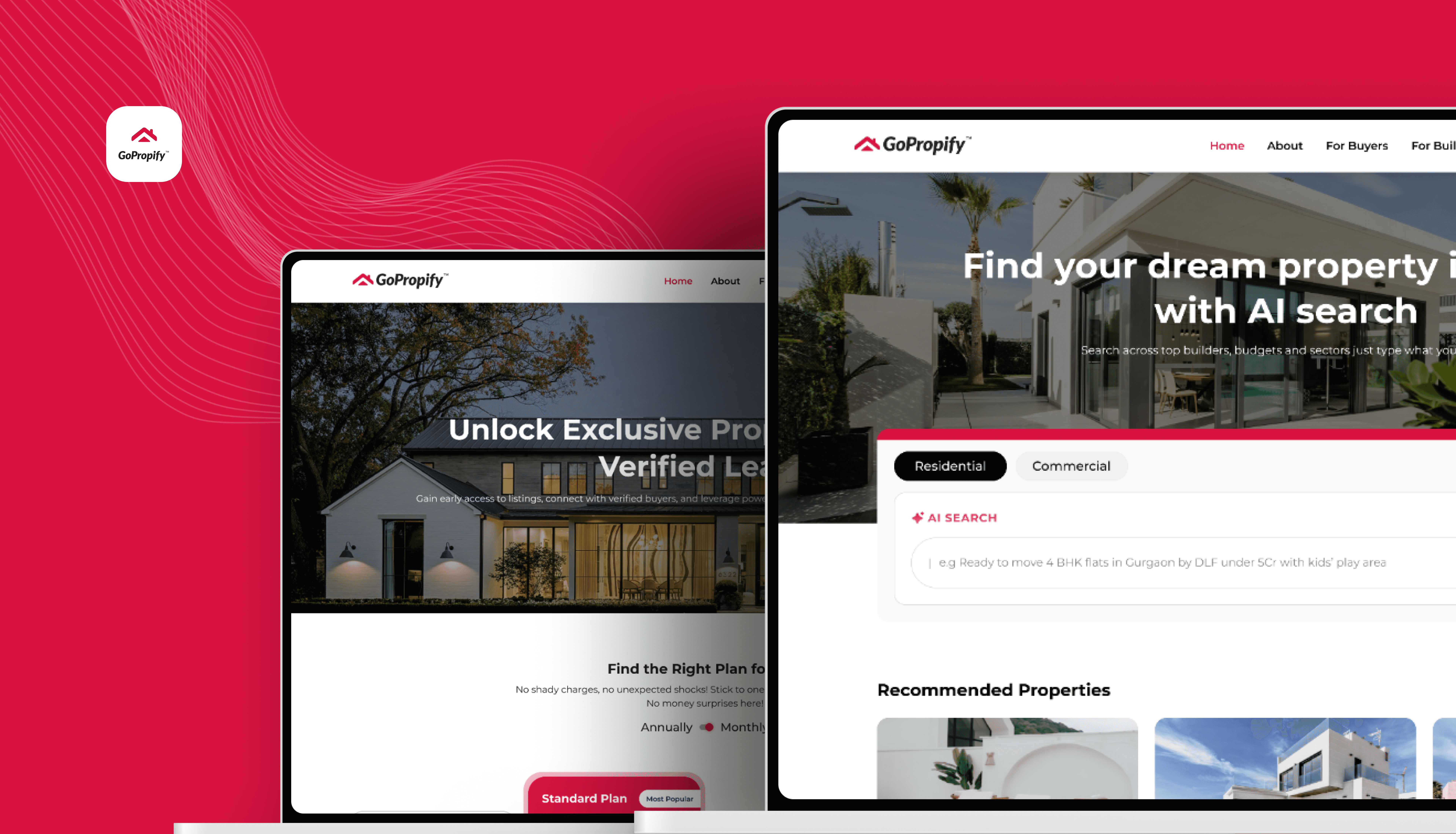
While working on GoPropify, I looked at how the existing experience presented property information and where the overall journey could be made clearer and easier to navigate.

THE PROBLEM
Too much information can make a property decision harder.
The challenge was not simply that the interface needed a visual refresh.
The bigger opportunity was to improve how information was organised and presented.
Users should be able to quickly understand:
What is this property?
Does it match what I'm looking for?
What are the important details?
What can I do next?
The redesign focused on creating a clearer hierarchy between these different pieces of information.

THE DESIGN CHALLENGE
How might we make property information easier to scan and act on?
I focused on three areas:
01 - Discovery
Help users find relevant properties without unnecessary friction.
02 - Understanding
Make important property information easier to scan and compare.
03 - Action
Keep the next step clear once a user finds something relevant.
The goal was to create a more structured experience without removing the depth of information users need when evaluating a property.

UNDERSTANDING THE EXISTING EXPERIENCE
Before changing the interface, I looked at the journey.
I mapped the main experience to understand how users moved through the platform.
The journey could be simplified into:
Enter the platform
↓
Explore properties
↓
Open a property
↓
Understand the details
↓
Take action
Looking at the experience this way helped me identify where information was competing for attention and where the hierarchy could be improved.

INFORMATION ARCHITECTURE
The challenge was organising information around the user's decision.
A property page can contain a lot of information - images, location, pricing, specifications, amenities, descriptions and actions.
Instead of presenting everything with the same visual weight, I organised the experience around the questions a user is likely to have while evaluating a property.
Primary information
Property identity
What is this?
Price / key details
Is it relevant to me?
Location
Where is it?
Property details
What does it offer?
Action
What can I do next?
This hierarchy became the foundation for the redesign.

EXPLORING THE LAYOUT
I explored different ways to balance information and action.
The property experience had to support both browsing and decision-making.
I explored different layouts to understand:
How much information should appear above the fold
How property images should interact with the information
Where the primary action should sit
How supporting information could be grouped
How the layout could scale responsively
The aim was not to add more UI.
It was to create better hierarchy with the information already available.

DESIGNING THE PROPERTY DISCOVERY EXPERIENCE
Finding the right property should feel straightforward.
The redesigned discovery experience focused on making property cards easier to scan.
Each card needed to communicate the most important information quickly while maintaining enough visual distinction between listings.
The hierarchy prioritised:
Property image
↓
Name / location
↓
Key property information
↓
Price / relevant details
↓
Next action

REDESIGNING THE PROPERTY DETAILS
The property page needed to answer questions in the right order.
Once a user opens a property, the experience shifts from discovery to evaluation.
So I changed the hierarchy to bring the most decision-relevant information
forward while keeping deeper details accessible.
The redesigned structure gives users a clearer path through the page:
→ Overview
→ Key details
→ Location
→ Property information
→ Additional details
→ Action

MAKING THE PRIMARY ACTION CLEAR
A property page should always answer: “What can I do next?”
One of the areas I paid attention to was the primary action.
After users have found a property they are interested in, the interface shouldn't make them search for the next step.
I therefore treated the primary action as part of the information hierarchy rather than as an isolated button.

RESPONSIVE DESIGN
The experience needed to work beyond one screen size.
The property journey can happen across different devices, so I considered how the hierarchy would translate from desktop to smaller screens.
Rather than shrinking the desktop layout, I adapted the structure based on available space and the priority of information.

DESIGN SYSTEM & CONSISTENCY
A redesign is only useful if the experience stays consistent.
As the interface expanded across different screens, I focused on maintaining consistency in:
Typography
Spacing
Buttons
Cards
Form elements
Icons
Property information patterns
This helped create a system that could be reused across the product rather than treating every screen as a separate design.

THE FINAL EXPERIENCE
Bringing the pieces together.
The final redesign created a clearer path from property discovery to evaluation and action.
The main improvements focused on:
Clearer hierarchy
More structured information
Stronger property discovery
More obvious actions
Responsive behaviour
DESIGN DECISIONS
A few decisions that shaped the redesign
Information before decoration
I prioritised useful property information over adding visual elements that didn't help the user make a decision.
Clear hierarchy
Not every piece of information needs the same visual weight.
Consistent patterns
Repeated interactions should look and behave consistently so users don't have to relearn the interface.
Responsive by design
The experience should adapt to the user's screen rather than simply scale down.

OUTCOME
The redesign focused on making an unfamiliar add-on easier to understand and easier to act on.
20%
Flexi Check-In opt-in rate
Travellers chose the option when the value and flexibility were clearly communicated.
94%
Usability task completion
Most participants were able to understand and complete the Flexi Check-In flow successfully.
50%
Reduction in decision time
Average decision time dropped from 14 sec to 7 sec after improving the information hierarchy and interaction flow.
Small closing line:
The goal wasn't to add more information, it was to make the right information easier to understand at the right moment.
WHAT I LEARNED
Good property UX is about helping users evaluate, not just browse.
This project made me think more carefully about the difference between showing information and helping someone make sense of it.
A property platform naturally contains a lot of information.
The design challenge is deciding:
What should users see first?
What can wait?
What needs emphasis?
And what should the user be able to do next?
That thinking helped me approach the redesign beyond just improving the visual appearance.

WHAT I WOULD IMPROVE
There is always more to validate.
If I continued working on the product, I would want to validate the redesigned journey with real users and understand where users still hesitate during property discovery and evaluation.
I would especially look at:
Search and filtering behaviour
Property comparison
Information users look for most
Enquiry/contact behaviour
Mobile browsing behaviour
This would help connect the design decisions more directly to measurable product outcomes.

FINAL REFLECTION
The best redesigns aren't about making a product look newer.
For me, the most important part of the GoPropify project was understanding that a redesign should solve a usability problem, not just a visual one.
The goal was to make a property platform feel easier to navigate, easier to understand and easier to act on.
Less visual noise.
Clearer information.
A more confident property journey.
WHAT I WOULD IMPROVE NEXT
If I were taking this project further, I would focus on validating the experience with real travellers and understanding how they respond to the feature in an actual booking environment.
I would specifically look at:
Whether travellers immediately understand what Flexi Check-In offers.
Whether the information provided is enough to make a confident decision.
Where users hesitate, go back, or look for additional information.
Whether the placement of the feature feels natural within the booking journey.
How the experience performs across different traveller types and booking scenarios.
The next step would be to combine usability feedback with behavioural data and iterate on the experience accordingly.
MY KEY TAKEAWAYS
This project taught me that designing a travel experience is often about reducing uncertainty rather than simply adding functionality.
A few things stayed with me:
Clarity is part of the experience.
Even a useful feature can create friction if users don't understand what they are getting.
Context matters.
Information is more useful when it appears at the moment the traveller needs it, rather than being presented all at once.
Small interactions can influence confidence.
The way an option is introduced, explained and confirmed can make a complex journey feel much simpler.
Design decisions should connect back to the user's problem.
Instead of designing screens independently, I tried to keep the original traveller need at the centre of each decision.
CLOSING
Sometimes the best experience isn't the one with the most features.
It's the one that makes a traveller feel like they understand what is happening, know what they are choosing, and feel confident moving forward.
That was the thinking behind my work on Flexi Check-In.
More flexibility for the traveller.
Less uncertainty in the journey.